


When it comes to health supplements, many people’s first thought might be, “It’s just a bottle, right?” But if you actually stand in front of a shelf, or scroll through an e-commerce product page, you’ll notice that packaging is no longer just a container. It’s the first handshake between the brand and the consumer. It’s the starting point of trust, and often determines that crucial “buy or pass” moment in just a second.
In 2026, health supplement packaging is undergoing a profound transformation. Sustainability is no longer just a slogan. Tech interactivity is moving from flashy gimmicks to practical applications. Personalization has shifted from a luxury to a necessity.
Here, we’ll explore five key trends and practical approaches to understand what packaging can truly captivate consumers.

Sustainability has been a popular topic for years, but very few brands implement it effectively. Many brands use biodegradable materials just to look eco-friendly, while the packaging structure remains “buy one, throw one.” By 2026, consumers expect more than just the word “recyclable.” They want to see a real, practical circular path for the product.
One practical step is the selection of recyclable materials. Using PCR (post-consumer recycled) plastics instead of traditional PVC or replacing EPS foam inserts with sugarcane fiber or cornstarch-based materials are effective solutions. The challenge is cost. Biobased materials can be 20–30% more expensive, but many consumers—especially those aged 25–40 in tier-1 and tier-2 cities—are willing to pay extra. The key is to communicate the value clearly. A QR code or brief text explaining, for example, “This bottle is made from 8 recycled plastic bottles,” is far more convincing than a generic “eco-friendly” icon.
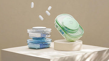
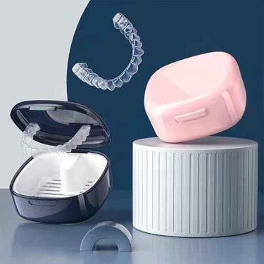
Another approach is reusable design. Brands can sell a high-quality ceramic or glass jar with the first purchase and offer refill packs for later. This reduces single-use waste and enhances brand loyalty. Once consumers have the jar at home, they are likely to repurchase from the same brand. However, the refill packs must maintain airtight seals and moisture protection, or the convenience is lost.
Even printing choices can enhance sustainability. Plant-based inks and UV printing reduce VOC emissions while improving the tactile feel. Matte finishes or subtle coatings can leave a subconscious impression that “this brand really cares” when consumers touch the packaging.

Technology can make packaging more than a static object. Here, “tech” does not mean turning the package into an electronic device. It’s about clever designs that communicate information efficiently and transparently.
Transparent bottles and visual designs seem simple but require careful planning. Transparency allows the product to “speak for itself.” Consumers can see capsule shapes, powder textures, or liquid colors, which builds trust more effectively than text descriptions. For products that emphasize natural ingredients or lack additives, transparency is a commitment. But some ingredients are light-sensitive. In such cases, partial windows can show the contents while protecting the product.
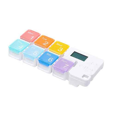
Smart labels must also provide real value. QR codes and RFID are common, but consumers will only scan if they gain useful information. Instead of a generic product page, labels can reveal ingredient sourcing, production batch details, or Certificates of Analysis (COAs). Some brands even use bottle caps with dosage reminders or provide sticker calendars to track daily intake. These low-cost interactions are often more memorable than high-tech gimmicks.
Microscopic imagery and ritual-inspired designs are a newer direction. Printing cross-sections of plants or spores with UV embossing can communicate “science meets nature.” This approach works best for mid-to-high-end brands emphasizing research. Casual or low-effort attempts can appear cheap, so execution quality is critical.
🎯 Our supplement labels use smart printing for traceability, anti-counterfeiting, and consumer engagement—ensuring quality while boosting brand trust and shelf appeal.

Personalization doesn’t mean letting every consumer design their own bottle. A practical approach is to leave “variable spaces” within standardized packaging.
Name or pattern customization is now feasible thanks to digital printing. Small-batch personalization works especially well for gifting. A box printed with the recipient’s name immediately creates a sense of ceremony. However, personalization increases production time and inventory complexity. Brands need to calculate costs carefully before implementing.
Scenario-based designs are another practical strategy. Athletes want portable, drop-resistant packaging with one-handed access. Travelers prefer compact, secure packaging that is TSA-friendly. New parents need bottles that are easy to open with one hand, childproof, and show clear product information. Designing different structures and formats for each scenario is smarter than relying on a one-size-fits-all bottle. For example, athletic products might use tube packaging or stick packs, while home-use products may come in larger bottles that emphasize seal quality and ease of access.

Color is a powerful visual language. Previous trends favored bright, saturated reds, blues, and yellows to convey energy and vitality. In 2026, the trend clearly shifts toward softer, more natural tones.
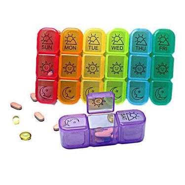
Rainbow color schemes can tell a story. Seven colors can represent seven nutrients in multivitamins, signaling variety and completeness. This works for complex formulas like plant powders. However, controlling saturation and brightness is key. Reducing saturation slightly and adding gray tones creates a more refined and sophisticated look, similar to the Morandi color palette.
Earthy and botanical tones are a safer choice. Deep greens, moss, terracotta, sandstone, and muted blues evoke “organic, pure, stable” impressions. These colors pair well with various materials—glass feels translucent, paper feels warm, and ceramics feel substantial. For single-ingredient or targeted products, these colors reinforce the “derived from nature” perception.

Globalization blends aesthetics and cultural symbols, but “fusion” is not simply putting a Chinese knot next to a Greek column. True fusion is about emotional resonance.
Eastern wellness elements, like acupuncture, traditional medicine drawers, or Tai Chi, can be reinterpreted in modern design. Minimal lines, whitespace, and restrained sophistication appeal to both older consumers valuing tradition and young consumers following the “Guochao” trend. The key is “translation,” not replication. Abstracting the dovetail structure of a medicine drawer into a box opening is more sophisticated than printing a literal herbal shop illustration.
Mediterranean-inspired packaging communicates lifestyle. Blues for sea and sky, yellows and oranges for sun and sand, combined with frosted glass jars and refillable bags, evoke “relaxation, nature, sustainability.” This resonates with middle-class consumers who travel and value quality. The colors and style naturally align with health supplements—who wouldn’t want to think of Mediterranean breezes while taking vitamins?
Trust is the foundation. Packaging may look beautiful, but if key information is unclear or unreadable, it fails. Ingredients, dosage instructions, and certifications (like the Blue Hat in China) must be legible. Avoid light gray small fonts on white, especially for older consumers.
Balance aesthetics with practicality. Unique openings or bottle shapes that seniors or arthritis patients can’t use are design failures. Convenience is not optional—it’s a baseline. Portability is also important. Bottles must fit the bag's side pockets, and stick packs must be easy to tear. These small details often determine whether consumers return.
Understand your target audience. Seniors need readability, safety, and large fonts. Young professionals care about aesthetics, portability, and shareability. Parents need childproof, one-handed access and transparent ingredient information. You can’t appeal to everyone—focus on your audience and execute it perfectly.
Compliance is essential. Follow regulations for certifications, placement, size, and color. Claims like “treat” or “cure” are strictly prohibited. Creativity must operate within legal limits. This isn’t a restriction—it’s a responsibility.

In 2026, health supplement packaging answers three questions: Why should consumers trust you? Why will they remember you? Why will they come back?
Eco-friendly & sustainable packaging demonstrates responsibility.
Tech interactivity ensures transparency.
Personalization provides exclusivity.
Natural colors enhance aesthetic appeal.
Cultural elements deliver emotional connection.
Integrating these five aspects transforms packaging from a cost center into a brand asset. For reference, check out:
Essential – rainbow refillable packaging
Mimi & Boo – Mediterranean-inspired refillable system
Routine Health+ – minimalist smart labels
VICTRIX – natural ingredient display
The key is not imitation, but understanding the logic behind these ideas and telling your own brand story effectively.