



In the pharmaceutical and dietary supplement industries, packaging is no longer simply a container. When consumers are faced with shelves filled with similar products, the first thing that catches their attention is often the packaging’s appearance, material quality, and design.
A custom paper pill box is one of the first physical touchpoints between a brand and its customers. Its design—from structure and finishing to material and functionality—is evolving from a supporting element into a strategic brand asset. It not only protects the product but also communicates brand value, influences the user experience, and can even contribute to better medication adherence and repeat purchases.
For brands, the real challenge is finding the right balance between practical functionality, distinctive branding, and production requirements within a limited packaging space.
The structure of a custom pill box directly determines how users interact with the product. Traditional flip-top and sliding boxes are well established, but modern consumers increasingly expect packaging to be convenient, portable, and functional.
Today, structural innovation mainly focuses on three areas: scenario-based design, behavior guidance, and supply chain efficiency.
1. Portable and Travel-Friendly Designs: Built for Life on the Move
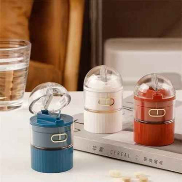
As modern lifestyles become increasingly mobile, carrying medicines and supplements throughout the day has become commonplace. Portable pill boxes are often designed in slim capsule or card-like formats, with a thickness of less than 1.5 cm, allowing them to fit easily into pockets, handbags, or small compartments.
These designs commonly use magnetic closures or elastic locking mechanisms to prevent accidental opening when the box is compressed inside a bag. This helps keep pills from spilling out or being exposed to moisture.
Some premium custom designs also include internal dividers to separate pills according to dosage times, creating a compact “one box, multiple compartments” solution for daily use.
From a usability perspective, one of the biggest challenges is making the box easy to open with one hand. Many brands therefore optimize the opening angle and resistance of the lid. If the opening angle is too small, accessing the pills becomes difficult; if it is too large, repeated bending can eventually damage the lid.
Well-designed custom paper pill boxes may use reinforced crease lines or internal support structures around the connection between the lid and box body. This improves durability while creating a controlled opening resistance that feels natural during everyday use.
2. Seven-Day Pill Boxes: From Packaging to a Health Management Tool
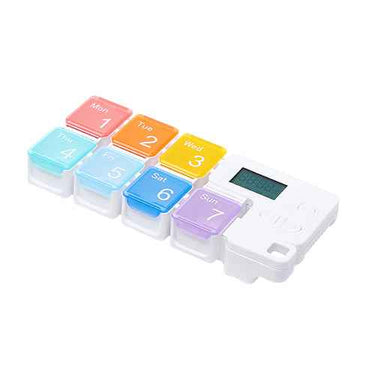
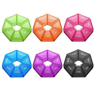
For prescription medicines and supplements taken over an extended period, seven-day and two-week pill boxes are becoming increasingly common. By using independent compartments, these designs physically separate daily doses so users do not have to repeatedly measure pills from a large bottle.
Two structural formats are particularly common:
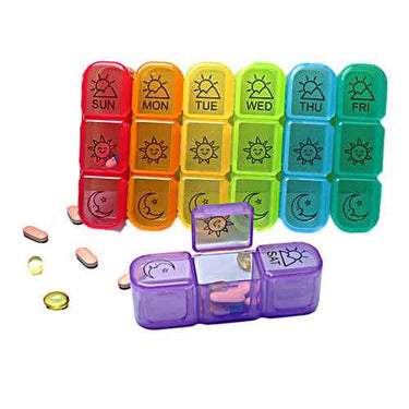
Integrated flip-top design: Multiple compartments are formed from a single folded paperboard structure, with each compartment featuring its own lid. The box can be printed with labels such as “Monday” through “Sunday” or corresponding icons. This format works well for home use because the dosage schedule is easy to see, while the larger overall surface also provides more space for brand communication.
Tear-off individual boxes: Seven or fourteen individual compartments are connected with perforated tear lines. Users can detach the required box each day and carry it separately. This format is particularly practical for travel because it is lightweight, quiet, and space-efficient. Each compartment can also be labeled with dosage times such as “Morning” or “Evening.”
The opening resistance of these pill boxes is an important detail that requires careful testing. If the compartments are too difficult to open, older users or people with limited hand mobility may struggle. If they are too loose, the box may open accidentally and allow pills to spill out.
Although seemingly minor, these structural details can directly affect how users perceive a product and whether they continue using it. For medication-management products, a thoughtful opening experience can therefore become an important part of the overall user experience.

3. Display and Gift-Ready Structures: Creating Shelf Appeal
In the OTC medicine and premium supplement markets, the presentation of the pill box is also important. A window cut-out is one of the most common approaches. A transparent window can be added to the front of the paper box using PET or biodegradable transparent film, allowing consumers to see the shape, color, or blister packaging inside.
This “what you see is what you get” approach can reduce purchase hesitation, particularly for new brands or newly launched dosage forms.
For premium supplement gift sets, brands may instead choose double-layer inserts or drawer-style box structures. The outer layer can feature high-quality printed paper, while the inner paper tray contains dedicated spaces for the medicine bottle, measuring spoon, and instruction leaflet.
Although these structures require more material and assembly work, they can significantly enhance the unboxing experience and support higher perceived value, particularly for seasonal campaigns and premium retail channels.
4. Supply Chain-Friendly Structural Optimization
User experience is only one part of packaging design. The structure must also work efficiently throughout manufacturing, storage, and transportation.
Reverse tuck-end boxes and auto-lock bottom structures are widely used in custom pill box packaging. They can remain flat during storage and shipping, reducing warehouse space requirements. On automated filling lines, the boxes can also be formed efficiently with minimal manual intervention, helping improve production efficiency and reduce labor requirements.
In addition, child-resistant (CR) packaging is mandatory for certain prescription medicines in some markets. These structures typically require a specific combination of pressing and rotating actions to open.
At the same time, the paperboard needs sufficient fatigue resistance to maintain its locking function after repeated opening and closing. This “design for safety” approach is increasingly influencing packaging development beyond prescription medicines and into certain high-dose supplement applications.
Structure determines how well packaging works. Surface finishing helps determine how it looks and feels.
Although finishing is often considered the final stage of packaging design, it plays an important role in communicating brand positioning and product quality.
1. Lamination: Matte or Gloss?
Matte lamination is one of the most versatile finishing options for pill box packaging. It creates a soft, diffused surface that reduces harsh reflections and gives printed graphics a more refined and understated appearance.
The tactile effect is equally important. A matte finish provides a smooth, slightly textured feel that can enhance the perceived premium and professional quality of the product. It is particularly suitable for prescription medicines, premium supplements, and herbal products.
Matte lamination can also provide a degree of scratch and moisture resistance, helping maintain the appearance of the box throughout transportation and distribution.
Gloss lamination, by contrast, takes a more vibrant approach. Its reflective surface can increase color saturation and graphic contrast, creating stronger visual impact. It is commonly used for functional foods, vitamin products, and other products targeting younger consumers who need to stand out on busy retail shelves.

2. Foil Stamping: Creating Strategic Visual Accents
Foil stamping is an effective way to add precise metallic details to packaging.
Gold and silver foil are commonly used for brand logos, product names, or key selling points such as “Time-Release” or “100% Natural.”
Against a matte paper background, metallic foil creates a strong visual contrast that naturally draws attention toward the selected element.
The key is restraint. Using foil selectively can create a noticeable increase in perceived quality without unnecessarily increasing production complexity. It is particularly effective for products with a premium or gift-oriented positioning.
3. Embossing and Debossing: Adding a Tactile Dimension
Embossing uses a mold to create raised patterns on the paper surface, giving the package an additional tactile dimension.
For example, embossing can be applied to flowers, leaves, brand symbols, or other key graphic elements. When consumers pick up the box, the raised texture creates a subtle physical interaction that reinforces associations with craftsmanship and refinement.
Debossing, on the other hand, creates recessed areas and can be used for selected information or design elements without competing with the main visual.
Overall, surface finishing should follow the principle of “targeted application and balanced combinations.” More finishing does not automatically mean better packaging. Selecting one or two techniques that match the brand positioning and budget is often more effective than combining every available option.

As sustainability becomes a global priority, material selection for pill box packaging is no longer purely a cost decision. It has also become a visible expression of a brand’s environmental responsibility.
At the same time, the physical properties of the material directly affect how well the packaging protects the product throughout its shelf life.
1. White Paperboard: The Most Balanced Choice
White paperboard remains one of the most widely used materials for pharmaceutical and supplement packaging because of its excellent stiffness, smooth surface, and printability.
Custom pill boxes commonly use 300gsm to 400gsm white paperboard. This range provides enough rigidity for automated packaging lines, helping prevent deformation and feeding problems during high-speed operations, while also delivering a smooth surface for detailed, high-resolution printing.
For most brands, white paperboard offers an effective balance between cost, structural performance, and visual quality.
Within this category, C1S and C2S coated paperboard serve different purposes. Single-side coated paperboard leaves the uncoated inner surface more suitable for certain adhesive applications, making it useful for boxes that require internal inserts or sealing. Double-side coated paperboard is more suitable when both the exterior and interior require high-quality printing.
High-bulk paperboard is another option worth considering. It provides greater thickness and stiffness at a similar basis weight, allowing brands to achieve the required structural performance with less paper material. This makes it a useful option for lightweight packaging strategies.
2. Kraft Paper and Recycled Paper: Natural Visual Appeal
Brands positioned around concepts such as natural, organic, and herbal are increasingly turning to kraft paper and paperboard made with a high percentage of recycled fiber.
The natural brown tone and visible fiber texture of kraft paper already communicate a strong visual message. Without excessive decoration, the material can convey a sense of simplicity, sustainability, and connection with nature.
Combined with water-based or soy-based inks, this type of packaging can appeal strongly to environmentally conscious consumers, particularly in European and North American markets.
However, kraft paper generally has a rougher surface than coated white paperboard, which can limit the reproduction of extremely fine graphic details. It therefore tends to work better with solid colors, line graphics, and clean typography rather than highly detailed gradients.
3. Functional Coated Paperboard: Enhanced Moisture Protection
For moisture-sensitive products such as effervescent tablets, chewable tablets, or certain probiotic products, standard paperboard may not provide sufficient protection.
In these cases, brands may consider functional coated paperboard with enhanced barrier properties.
Common solutions include:
PET-laminated paperboard: A thin PET film is laminated to the paperboard surface to improve moisture resistance while maintaining the flexibility and rigidity required for folding.
Water-based barrier coatings: Water-based acrylic or polyvinyl alcohol (PVA) coatings can create a dense barrier layer on the paperboard. These solutions can reduce reliance on conventional plastic laminates and may offer better compatibility with recycling systems, depending on the final packaging structure and local recycling requirements.
Functional materials typically cost more than standard white paperboard, but for products shipped long distances or sold in humid environments, the added investment can protect product quality and reduce packaging-related complaints.
4. Environmental Certifications and Traceability
When selecting materials, FSC certification has become an important consideration for brands targeting international markets.
Using FSC-certified paper means the fiber comes from responsibly managed sources, allowing brands to communicate responsible sourcing through the FSC label where applicable.
Some leading brands are also beginning to communicate carbon footprint information and recycling guidance directly on packaging. Making environmental information more accessible to consumers is becoming increasingly important as sustainability expectations continue to expand globally.

Different products and brand positions require different packaging priorities. By combining structural design, finishing techniques, and material selection, current market requirements can broadly be organized into five design strategies:
| Strategy | Core Need | Recommended Combination |
|---|---|---|
| Traditional Pill Box | Classic, reliable, cost-controlled | White paperboard + gloss lamination + standard folding structure |
| Portable Pill Box | Compact, lightweight, travel-friendly | Lightweight paperboard + matte lamination + magnetic/elastic closure |
| Personalized Pill Box | Distinctive appearance, strong recognition | Custom die-cut shape + selective gold/silver foil + high-bulk paperboard |
| Eco-Friendly Pill Box | Sustainability and natural aesthetics | FSC kraft paper + water-based ink + no lamination or recyclable barrier coating |
| Decorative Pill Box | Gifting, seasonal, or collaboration campaigns | Multiple foil finishes + embossing + drawer-style structure |
When selecting a direction, brands should follow a “one primary, one secondary” principle. Establish the main packaging objective first, then support it with one complementary finishing or structural feature.
Adding every available option can quickly increase costs while making the design visually complicated. A focused packaging concept is often more effective at communicating a clear brand identity.
The design of a custom paper pill box has moved far beyond the simple goal of “making the package look good.” It is now a multi-objective process in which structural design must balance user experience and production efficiency, surface finishing must support brand positioning, and material selection must address both sustainability and product protection.
Every packaging decision reflects an understanding of user behavior, brand positioning, manufacturing requirements, and supply chain costs.
When these elements work together within a single paper box, the result becomes much more than a container. It becomes a complete and convincing expression of brand value.
For brands competing in an increasingly crowded health and wellness market, understanding and applying these packaging principles can create meaningful differentiation—from the first impression on the shelf to the everyday experience in the consumer’s hands.
Pines provides customized packaging solutions for pharmaceutical, supplement, and personal care products, with a focus on practical design, brand customization, and user-oriented packaging solutions.
From structure and materials to printing and finishing, customized paper pill box packaging can be developed around specific product requirements, brand positioning, and target market needs.

